Dynamic Content Generation
WARNING
This tutorial assumes that you have a basic understanding of the structure of JSON-UI and have familiarity with bindings and collections. If you aren't familiar, you may check out Intro to JSON UI and JSON UI Documentation first.
You also need to know how to add elements to a screen's entry point to use this code. Refer to Adding HUD Elements.
Introduction
JSON UI allows dynamic generation of UI elements through the use of factories and grids. This is useful when you don't know how many elements the UI should have beforehand. This tutorial focuses on the use of both factories and grids.
INFO
Throughout this tutorial, the terms "control" and "element" are used synonymously.
Factories
A factory generates UI elements specified in its control_name or control_ids properties.
- Invocation: Many of the vanilla factories are invoked natively by the engine. Alternatively, factories can be invoked manually by overriding the
#collection_lengthproperty. - Data Binding: For the use of
#collection_length, the factory must reside within a collection-supporting container (e.g.,collection_panelorstack_panel). The value can either be anintor astring[]based on the implementation of the factory.
Key properties
| Property | Type | Short Description |
|---|---|---|
| name | string | The unique identifier for the factory. This is critical for factories natively invoked by the engine, though custom factories can use any arbitrary string. |
| control_name | string | Reference to the control to be generated by the factory |
| control_ids | Object | An object mapping arbitrary string keys to the references of the controls to be generated. Used when generating multiple distinct controls. Must remain unchanged for natively invoked factories. |
| factory_variables | string[] | List of variables that should be passed to the controls generated by the factory |
| max_children_size | int | Maximum number of controls to be generated |
Usage
Using control_name:
In this case, #collection_length must be overridden with an int value. This is the number of elements that will be generated.
{
  "hud_apple": {
    "type": "image",
    "texture": "textures/items/apple",
    "size": [32, 32]
  },

  "apple_factory": {
    "type": "stack_panel",
    "size": [ "100%cm", "100%c" ],
    "factory": { // Defined in a stack_panel (Supports collection)
      "name": "hud_apple_factory",
      "control_name": "hud.hud_apple" // Reference to hud_apple
    },
    "bindings": [
      {
        "binding_name": "#hud_title_text_string",
        "binding_name_override": "#count"
      },
      {
        "binding_type": "view",
        "source_property_name": "(#count - 'Count:' + 0)", // Gets the int value
        "target_property_name": "#collection_length" // Overriding #collection_length
      }
    ]
  }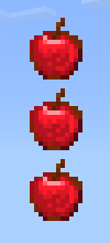
}Here, an integer value is sent through the title as Count:{value} that indicates the number of elements to generate. The bindings listed above first fetch the title string and store it in #count. Then, #count - 'Count:' gets the int value and #collection_length is overridden with this value. Note: + 0 sets a default value of 0 if the string is empty.
Expected result: For title: Count:3
Using control_ids:
In this case, #collection_length must be overridden with an array of strings. The strings are the keys defined in control_ids. There's not much freedom with this approach as there is no way to manipulate arrays in JSON UI. Instead, we can pre-define some arrays within the property_bag and choose from them. The elements will be generated in the order specified in the array.
{
"hud_apple": {
"type": "image",
"texture": "textures/items/apple",
"size": [32, 32]
},
"hud_label": {
"type": "label",
"text": "Apple!",
"shadow": true
},
"apple_factory": {
"type": "stack_panel",
"size": [ "100%cm", "100%c" ],
"factory": {
"name": "hud_apple_factory",
"control_ids": {
"apple": "hud.hud_apple", // An arbitrary name mapped to the reference of a control
"label": "hud.hud_label"
}
},
"property_bag": {
// Some pre-defined arrays
"#list1": [ "apple", "label" ],
"#list2": [ "label", "apple" ]
},
"bindings": [
{
"binding_name": "#hud_title_text_string",
"binding_name_override": "#choice"
},
{
"binding_type": "view",
"source_property_name": "('#list' + #choice)", // Constructing key name
"target_property_name": "#collection_length"
}
]
}
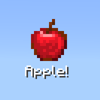
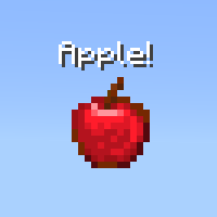
}Here, we have defined two controls in control_ids and two arrangements of these controls as #list1 and #list2. In the bindings, we fetch the title string and store it in #choice, which is an integer representing the list to be selected. Then using ('#list' + #choice), we construct the name of the list and that list is then overridden to #collection_length.
Expected result: For title: 1 and 2 respectively
Factory (Extra):
You can define factories directly using "type": "factory" as well. These factories are always invoked natively by the engine. However, it is possible to define these factories in the ways discussed above we can also modify the control references to generate custom elements instead.
{
  "main_screen_content": { // Vanilla code from server_form.json
    "type": "panel",
    "size": [0, 0],
    "controls": [
      {
        "server_form_factory": { // Name of control here acts as the factory name and thus should remain unchanged
          "type": "factory",
          "control_ids": {
            "long_form": "@server_form.long_form",
            "custom_form": "@server_form.custom_form"
          }
        }
      }
    ]
  }
}Grids
Grids generate and arrange UI elements in a grid layout. The elements are generated from a template control specified in its grid_item_template property. We can either generate a fixed number of elements by defining grid_dimensions or a variable number by overriding its #maximum_grid_items binding or maximum_grid_items property.
Key properties
| Property | Type | Short Description |
|---|---|---|
| grid_dimensions | Vector [columns, rows] | Number of columns and rows the grid should have. Can generate a maximum of columns × rows elements |
| grid_dimension_binding | string | Binding name that provides dimensions for the grid. Only takes hardcoded bindings. |
| grid_item_template | string | Reference to the control to be generated by the grid |
| grid_rescaling_type | enum | Can be none, horizontal, vertical |
| maximum_grid_items | int | Maximum number of controls to be generated Corresponding binding #maximum_grid_items |
| grid_position | Vector [row, column] | Position of a control inside a grid |
DANGER
Try not to use vertical as the value of grid_rescaling_type. It may crash your game.
Usage
INFO
Grids typically have a default size of ["100%c", "100%c"]. It is ideal to keep the height dynamic (100%c). If a fixed height is applied, generated elements may overlap if the height is too small, or have unintended gaps if the height is too large.
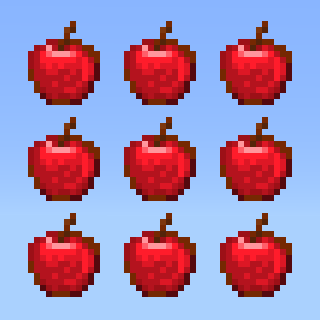
Using grid_dimensions:
It is recommended not to override the size property in this case, as some elements can go outside the grid bounds and mess up the layout.
{
  "hud_apple": {
    "type": "image",
    "texture": "textures/items/apple",
    "size": [32, 32]
  },

  "apple_grid": {
    "type": "grid",
    "grid_dimensions": [3, 3],
    "grid_item_template": "hud.hud_apple"
  }
}Expected result:
Overriding #maximum_grid_items:
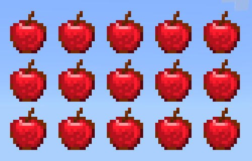
For this to work properly, you have to modify the width of the grid. This is because the number of columns in this case will be floor( width of grid / width of template control ). Moreover, we need to set grid_rescaling_type to horizontal. Then we have to override #maximum_grid_items through bindings, or alternatively, define the maximum_grid_items property.
{
  "hud_apple": {
    "type": "image",
    "texture": "textures/items/apple",
    "size": [32, 32]
  },

  "apple_grid": {
    "type": "grid",
    "size": [160, "100%c"], // floor(160 / 32) = 5; Meaning the grid will have 5 columns
    "grid_item_template": "hud.hud_apple",
    "grid_rescaling_type": "horizontal",
    "bindings": [
      {
        "binding_name": "#hud_title_text_string",
        "binding_name_override": "#count"
      },
      {
        "binding_type": "view",
        "source_property_name": "(#count - 'Count:' + 0)", // Gets the int value
        "target_property_name": "#maximum_grid_items" // Overriding #maximum_grid_items
      }
    ]
  }
}Here, an integer value is sent through the title as Count:{value} that indicates the number of elements to generate. The bindings listed above first fetch the title string and store it in #count. Then, #count - 'Count:' gets the int value and #maximum_grid_items is overridden with this value.
Expected result: For title: Count:15
Grid Position
There might be situations where you'd want to manually add controls to the grid instead of generating them from a template. With the grid_position property you can place your control anywhere on the grid.
Usage
Let's say we have a grid with 2 columns and 2 rows and we want to place our controls in this way-
|  [0, 1] - 1 [0, 1] - 1 |
|---|---|
| [1, 0] - 2 |
|
The format [row, column] indicates the placement within the grid, where the first integer is the row index and the second integer is the column index. The following integer is the index it takes inside the grid for a defined collection.
The code:
{
  "hud_apple": {
    "type": "image",
    "texture": "textures/items/apple",
    "size": [32, 32]
  },

  "apple_grid": {
    "type": "grid",
    "size": ["100%c", "100%c"], // Define it explicitly to avoid layout issues
    "grid_dimensions": [2, 2],
    "controls": [
      {
        "[email protected]_apple": {
          "grid_position": [0, 0]
        }
      },
      {
        "[email protected]_apple": {
          "grid_position": [1, 1]
        }
      }
    ]
  }
}Expected result:
Useful Information
- When used with a collection, Factories and Grids automatically index generated elements.
- Generated elements can access outside bindings via
source_control_name, but outside elements cannot access bindings from generated elements. - Invisible elements inside a Grid still occupy physical space, which can leave unintentional gaps in your UI.
- In Grids, animations linked with the
nextproperty can appear bugged. After the first animation, the duration divides among the grid elements, causing subsequent animations to speed up. (flip_bookanimations are the only exception).
Contributors

